Chapter 2: The first curve
npm install ml-time-graphA time series is a list of instants and values. That is all it takes to see something:
import { mount } from 'ml-time-graph';

const chart = mount('#chart', {
  series: [
    {
      name: 'Temperature',
      data: [
        { time: Date.parse('2026-08-31T00:00:00Z'), value: 6.2 },
        { time: Date.parse('2026-08-31T01:00:00Z'), value: 6.0 },
        { time: Date.parse('2026-08-31T02:00:00Z'), value: null },
      ],
    },
  ],
});
Three details are easy to guess wrong, so they are spelled out: mount takes a
CSS selector or an element; time is a number in milliseconds, not a
Date; and value may be null — that is the gap from two sections down, not
a mistake.
Your data looks different
It almost always does. A time-series database hands over pairs, a REST API
names the fields differently and counts in seconds, a CSV export delivers
everything as text. toDataPoints converts it — in one place, instead of in
every caller:
import { toDataPoints, toSeries } from 'ml-time-graph';

toDataPoints([[1758434400000, 6.2], [1758438000000, 6.0]]);
toDataPoints(rows, { time: 'ts', value: 'val', timeUnit: 's' });
toDataPoints(rows, { time: (r) => r.meta.at, value: (r) => r.payload.kw });

// Name and conversion in one line:
series: [toSeries('Temperature', rows, { time: 'ts', value: 'val' })];
Why the middle does not simply accept everything: { time, value } is what the
scales, the zone splitting, the tooltip and the Go port all read. Every further
shape allowed there would have to travel through each of them — and be
maintained in both libraries. Strict in the middle, soft at the edge.
Three of its decisions are deliberately inconvenient, and each saves you an afternoon later:
- Numbers are milliseconds unless you say otherwise. There is no guessing:
a relative time base (0, 1000, 2000 …) would silently be shifted by a factor
of 1000. Unix seconds get
timeUnit: 's'— or'auto', which leaves exactly that relative base alone. - A missing reading becomes a gap, not a zero.
null,undefined,NaNand the empty string all break the line. Drawing a missing measurement as 0 would claim a value the sensor never reported. - A non-numeric string throws — naming the row. That is nearly always a mistyped field name, and an empty chart will not tell you so.
ISO strings and Date objects are recognised on their own, numeric strings are
converted, and the result is sorted by time.
What the library does on its own
Scaling axes, choosing time ticks, placing labels, without anyone supplying numbers. That sounds obvious and is not: tick selection is where charting libraries part ways.
Across 24 hours you want hours, across two years months — and in between, something that is neither crowded nor bare. The library decides that from the actual range, not from a fixed rule.
Large values are shortened to 1.5k or 2.0M only where the step allows it —
a pressure axis around 1000 hPa with ticks every 10 keeps 1000, 1010,
1020, because the short form would label them all 1.0k. Grid lines are one switch per axis:
axes: { x: { grid: true }, left: { grid: true } }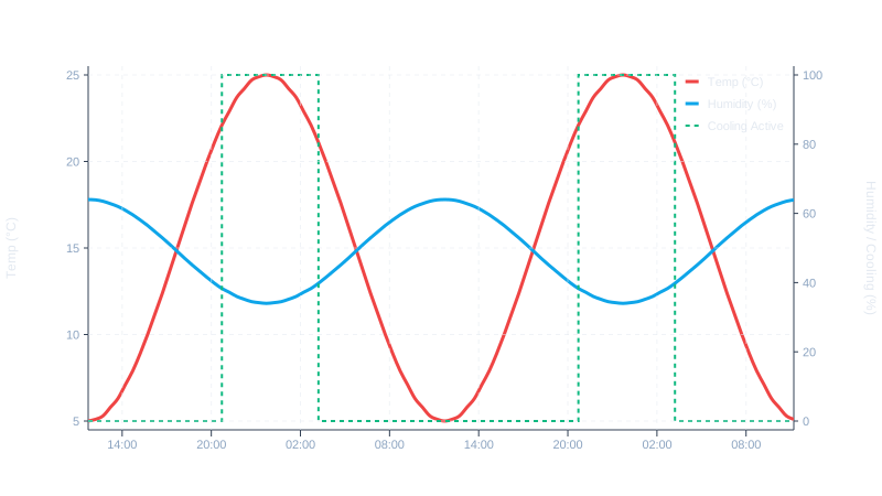
Room at the edge
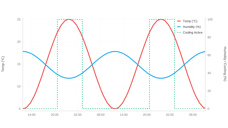
The computed axis ends exactly at the smallest and largest reading. That is right — and it has a visible side effect: the plot is clipped to its rectangle, so a wide line at the maximum has half its stroke outside it. At ten pixels, five are missing, and a marker loses half its disc.
padding keeps the automatic computation and adds room around it:
axes: { left: { padding: 8 } }                       // top and bottom
axes: { left: { padding: { top: 24, bottom: 4 } } }  // e.g. room for a label
It is given in pixels, not as a share of the value range. The reason lies in the cause: it comes from stroke width and marker size, and those are measured in pixels. The same eight then works for a series in °C and one in kilowatts — a percentage would have to be found again for every chart. As a rule of thumb: half the widest stroke plus a little.
Two things padding deliberately does not do. It leaves an explicitly set
domain alone — whoever fixes the range does not want it quietly widened. And
padding that does not fit the chart height is skipped rather than producing an
inverted scale: a curve at the edge still beats no curve at all.
Points on the curve
Markers show where a reading actually was — with a smoothed line that is otherwise invisible. They carry their own pen and their own colours and do not inherit the line's stroke width:
style: {
  line:    { color: '#4285f4', width: 6 },
  markers: {
    type: 'circle',      // 13 shapes
    size: 5,             // radius in pixels
    stroke: '#1e3a8a',   // outline; defaults to the line or zone colour
    fill: '#ffffff',     // fill; same default
    strokeWidth: 1.5,    // the marker's own pen, independent of line.width
    threshold: 500,      // only draw while the series has ≤ n points
  },
}
The last line matters most on long series: past a few hundred points the symbols
merge into a band and say nothing. threshold hides them from that count on, and
the line remains.
The Style Editor in the demo gallery has Line width and Marker pen as two separate sliders — the difference takes a second to see there.
A gap is a gap
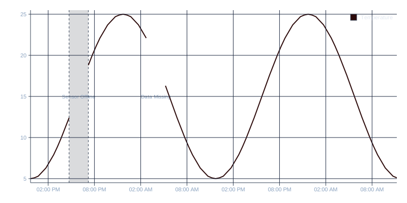
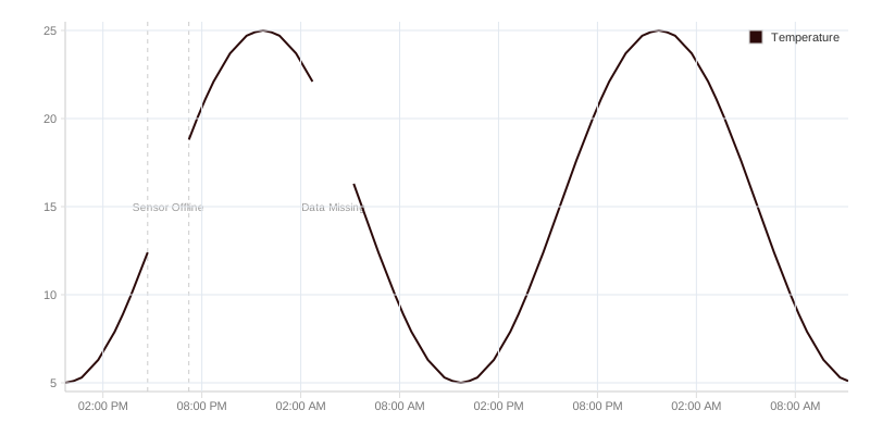
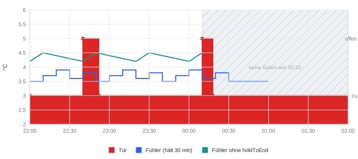
When a value is missing, the line breaks — it is not interpolated. A solid line across a measurement gap asserts data that does not exist, and that is exactly where wrong conclusions get drawn.
A device that went quiet
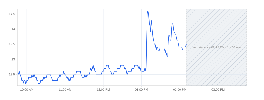
A line that simply ends says nothing — and in monitoring, a probe that stopped
reporting is the most important news on the screen. gaps.atEnd marks it:
gaps: { atEnd: { afterMs: 30 * 60_000, label: 'no data since {since} · {duration}' } }When the last reading is more than afterMs before now, a hatched area runs
from that reading to now, labelled with {since} (with the date when it was
another day) and {duration} (45 min, 3 h 12 min). The library reads no
clock: now is atEnd.now or the end of the time axis, so screen, PDF and test
show the same. One series can opt out — gaps: { atEnd: false } on a sensor
that only reports on change — or set its own afterMs.
A contact that reports only on change
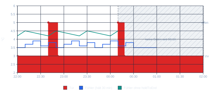
The opposite case: a door contact is silent on purpose. It reports when the door opens and
when it closes, nothing in between, and "closed" holds until the next report. Its line,
though, ends at that last report and looks exactly like the outage above. holdToEnd says
what the data means:
{ name: 'Door', data, holdToEnd: true }                    // to the end of the axis
{ name: 'Probe', data, holdToEnd: { maxAgeMs: 30 * 60_000 } } // at most 30 minutes
The line and its fill run on to the end of the time axis, or to gaps.atEnd.now; with
maxAgeMs no further than that after the last report. Only the drawing is extended. Point
markers, the tooltip, statistics and the value axis still see the real readings, and the
series gets no gaps.atEnd area, because by definition it has not gone quiet. A trailing
value: null still ends the line, since that gap is stated in the data.
Steps, not curves
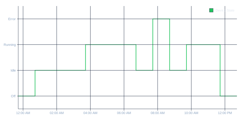
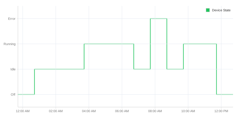
Not every quantity changes continuously. A switch state, a counter, a setpoint jumps — and belongs drawn as a step, not as a curve. A sloped line between two switch states shows a transition that never happened.
A smooth curve must not invent readings
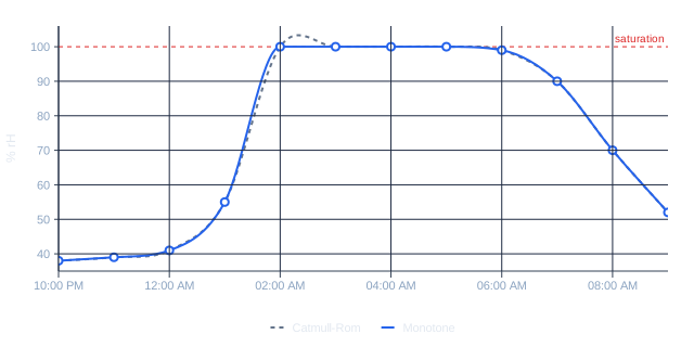
Smoothing is a judgement, not a decoration. Between two readings the library has to draw something, and the method it uses decides what that something claims.
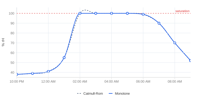
The default, a Catmull-Rom spline, takes its direction from the neighbouring points. That is soft and cheap, and it overshoots: between two readings it produces values that neither of them is. Where the quantity has a ceiling, the picture then asserts a measurement that cannot exist — humidity above 100 %, a tank fuller than full.
Set smoothingType: 'monotone' and the curve stays inside the span between two
readings. A plateau stays a plateau.
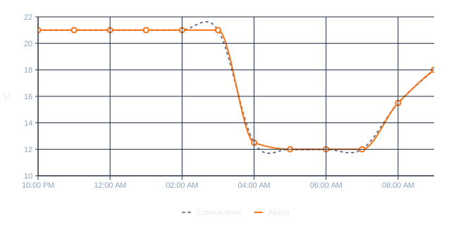
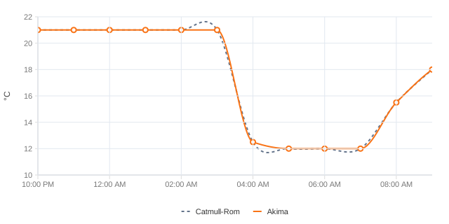
The second case is the edge. A sensor that transmits only when something changes
gives you a long quiet stretch and then a cliff — a window opened, a pump
switched off. Catmull-Rom sees the drop coming and starts moving early: it
climbs before it falls, so the chart shows a brief warm spell that never
happened, and undershoots afterwards. smoothingType: 'akima' weighs the slope
against that edge and holds the flat line until the drop arrives.
Both run in the browser and on the server and produce the same curve. And both
only do anything where smoothing is on: the method chooses how to smooth,
never whether. Marking the readings — markers: { type: 'circle' }, as in the
figures above — is worth it wherever smoothing is in play. It is the only thing
that tells a reader which points were measured and which the curve made up.