Chapter 4: What only the browser can do
The previous chapters could be told with pictures. This one cannot — it is about things you have to do in order to understand them.
Zoom and pan
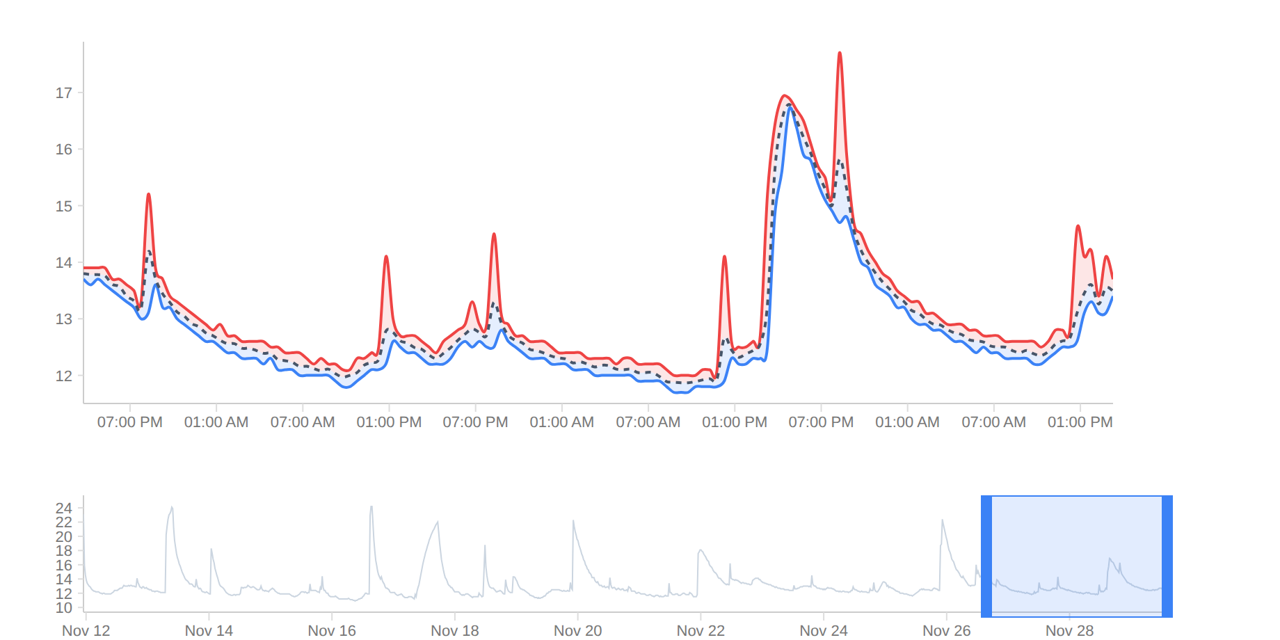
A range you can set is fundamentally different from one somebody chose for you. Drag to zoom in, double-click to go back, wheel for continuous zoom.
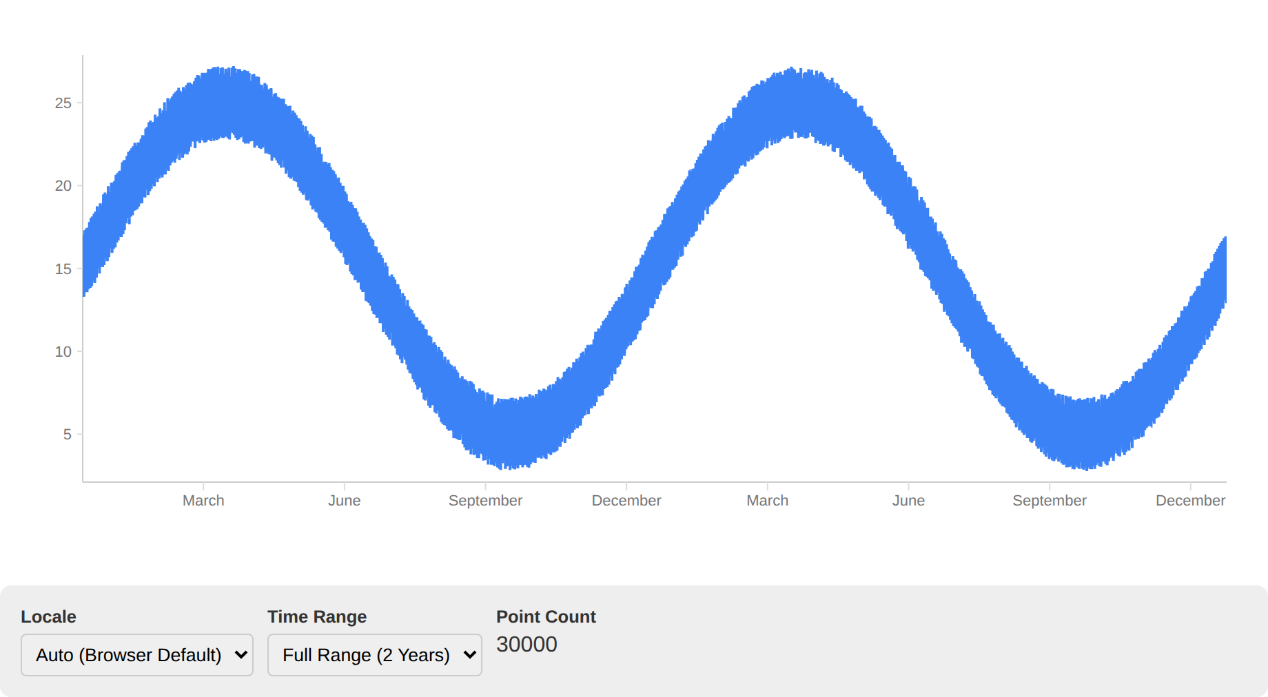
Many points
30,000 readings is not an edge case, it is a year at one-minute resolution. The library does not draw every point but what would be visible at the current resolution — and does it so that outliers survive. Naive thinning would swallow exactly the spikes you are looking for.
Several axes
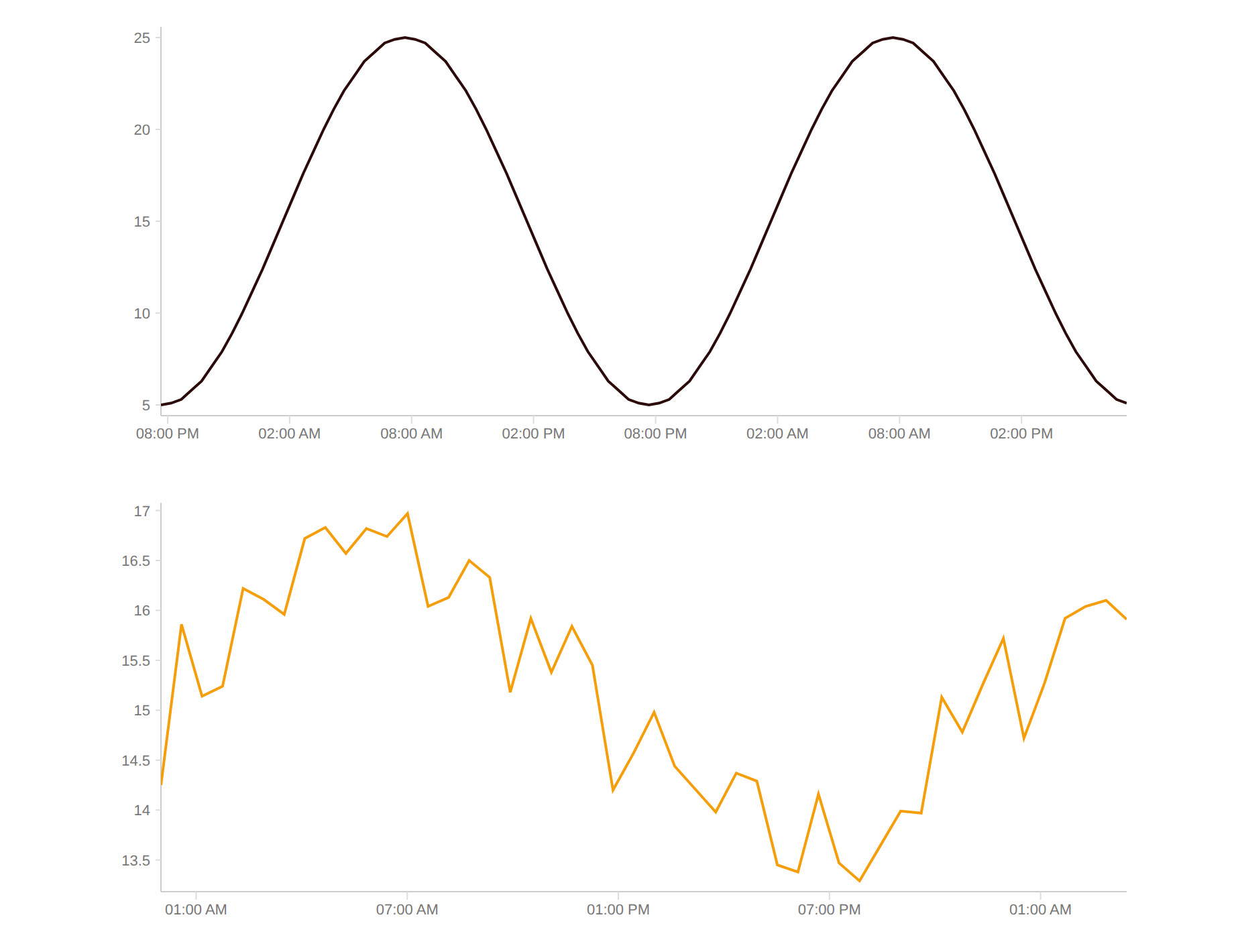
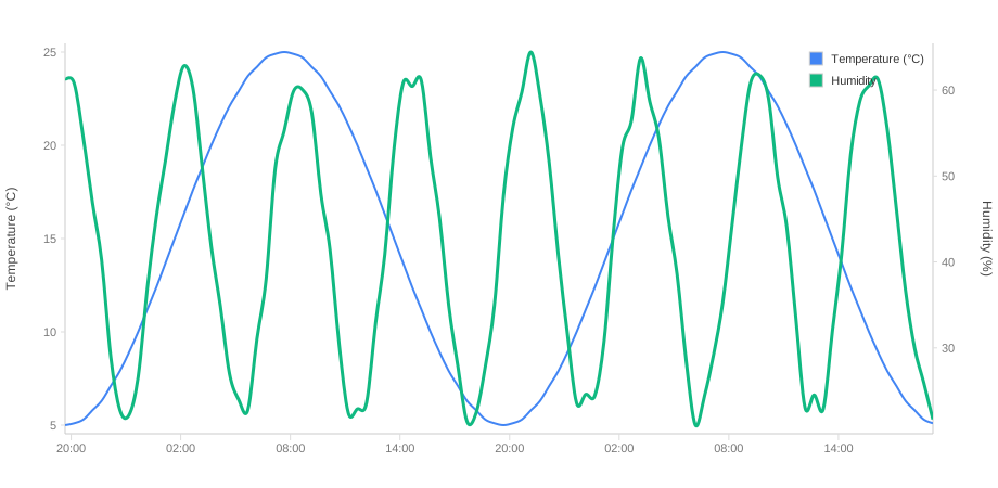
Temperature and humidity in one picture, on separate scales. The second axis is convenient and seductive: two curves in one frame suggest a relationship that the choice of scales produced, not the data. Use it where the relationship is established, not to imply one.
From three axes on — or when you want to decide yourself which sits left and
which right — use the array form axes.y instead of axes.left and
axes.right, and assign each series with yAxisIndex. Every axis then carries
its own title, in its own colour, beside its own line:
axes: {
  y: [
    { position: 'left',  label: 'Temperature (°C)', axis: { color: '#ef4444' } },
    { position: 'left',  label: 'Dew Point (°C)',   axis: { color: '#f59e0b' } },
    { position: 'right', label: 'Humidity (%)',     axis: { color: '#3b82f6' } },
    { position: 'right', label: 'Pressure (hPa)',   axis: { color: '#10b981' } },
  ],
},
series: [{ name: 'Temperature', data, yAxisIndex: 0 }, /* … */],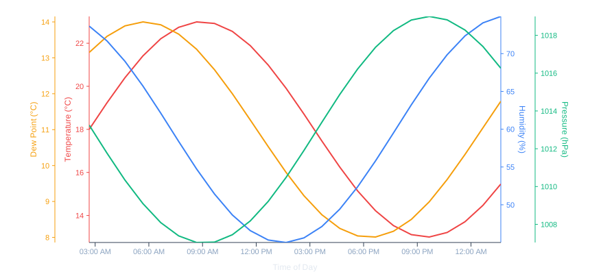
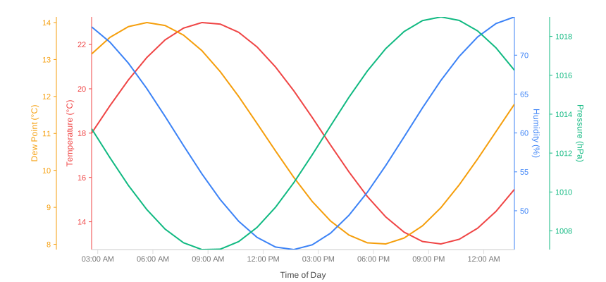
axes.y, two per side — drawn by the Go renderer.Where a title goes, the library works out on its own: beside the tick labels of
its axis, in the first gap wide enough to hold it. What no longer fits moves out
to the margin. For a title to find room between two axes it needs roughly 14 px
on top of the labels — with readings like 1030 hPa that means about 70 px of
axis spacing rather than the default 50:
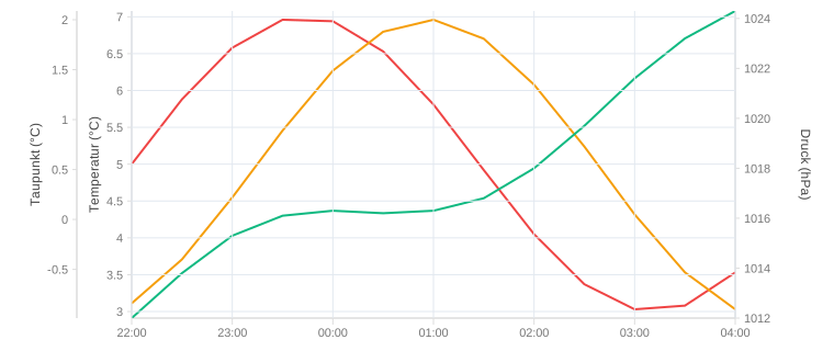
{ position: 'left', offset: 75, label: 'Dew Point (°C)' }Without that room the titles end up side by side in the margin instead of each next to its axis. They never end up on top of each other: every strip taken is closed to the next title.
When you want a title in a particular place, labelOffset sets it: the distance from the axis
line to the middle of the title. The search is skipped for that title, and the others avoid
it. The same works in the left/right form, where the title otherwise sits 14 px from the
edge of the image:
{ position: 'left', label: 'Dew Point (°C)', labelOffset: 34 }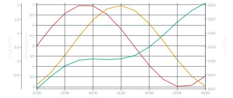
Which series share an axis is a question the data can answer. axisGroups
takes unit and readings per series and suggests: same unit and nearby
ranges share one; a gap larger than the larger range gets its own. Input order
is kept, so the axes do not jump when a sensor is added:
import { axisGroups } from 'ml-time-graph';

const { indices, axes } = axisGroups(sensors.map((s) => ({ unit: s.unit, data: s.data })));
new MLTimeGraph({
  series: sensors.map((s, i) => ({ ...s, yAxisIndex: indices[i] })),
  axes: { y: axes },
});
It applies nothing — it is a suggestion you can still overrule.
A legend you can click
With five sensors in one frame, hiding four is the fastest way to look at the fifth. Until 1.12.0 that meant drawing the legend yourself, because the built-in one was a label and nothing more — a click did nothing, and there was no way to reach a single entry.
Now each entry is its own group, and it carries the same key as the series it
names: #legend-temperature here, #series-temperature there. From one to
the other is a string replacement, not a lookup by display name. itemClass
adds a class of your own, and that is all the library offers — it brings nothing
to click with, it brings something to click on:
legend: { show: true, itemClass: 'clickmetotoggle' }container.addEventListener('click', (e) => {
const item = e.target.closest('.clickmetotoggle');
if (!item) return;
container.querySelector('#' + item.id.replace('legend-', 'series-'))
.classList.toggle('hidden'); // .hidden { display: none }
});One handler for the whole chart. Every demo on this site uses exactly that code, installed once in the demo harness — try it on any chart with a legend below.
That it works at all rests on a promise from 1.3.0: the key is stable. It is
derived from the series' id, or from its name, and it is the same in TypeScript
and in Go. Before that it carried a timestamp and changed on every render, so a
stylesheet or a handler written against it pointed at nothing a second later.
Two charts on the same page that both show a series called Temperature would
write #series-temperature twice — invalid HTML, and getElementById finds the
wrong chart. Since 1.17 each chart takes an idPrefix:
new MLTimeGraph({ idPrefix: 'cellar', /* … */ }); // #cellar-series-temperatureThe handler above keeps working unchanged: cellar-legend-temperature turns
into cellar-series-temperature. The classes .legend-item--temperature and
.series--temperature carry no prefix — they are for stylesheets, which are
meant to hit every chart at once.
The opposite problem comes from the page around the chart. The classes are plain words,
series, time-axis, chart-grid, and a rule like .series { display: none } in the page's
stylesheet would hit them. classPrefix puts a prefix in front of every class the chart
writes. Unlike idPrefix it is the same for every chart in an application:
new MLTimeGraph({ classPrefix: 'mltg', /* … */ }); // class="mltg-series mltg-series--temperature"Your own legend.itemClass stays as you wrote it, because your handler depends on it.
Drawing it yourself
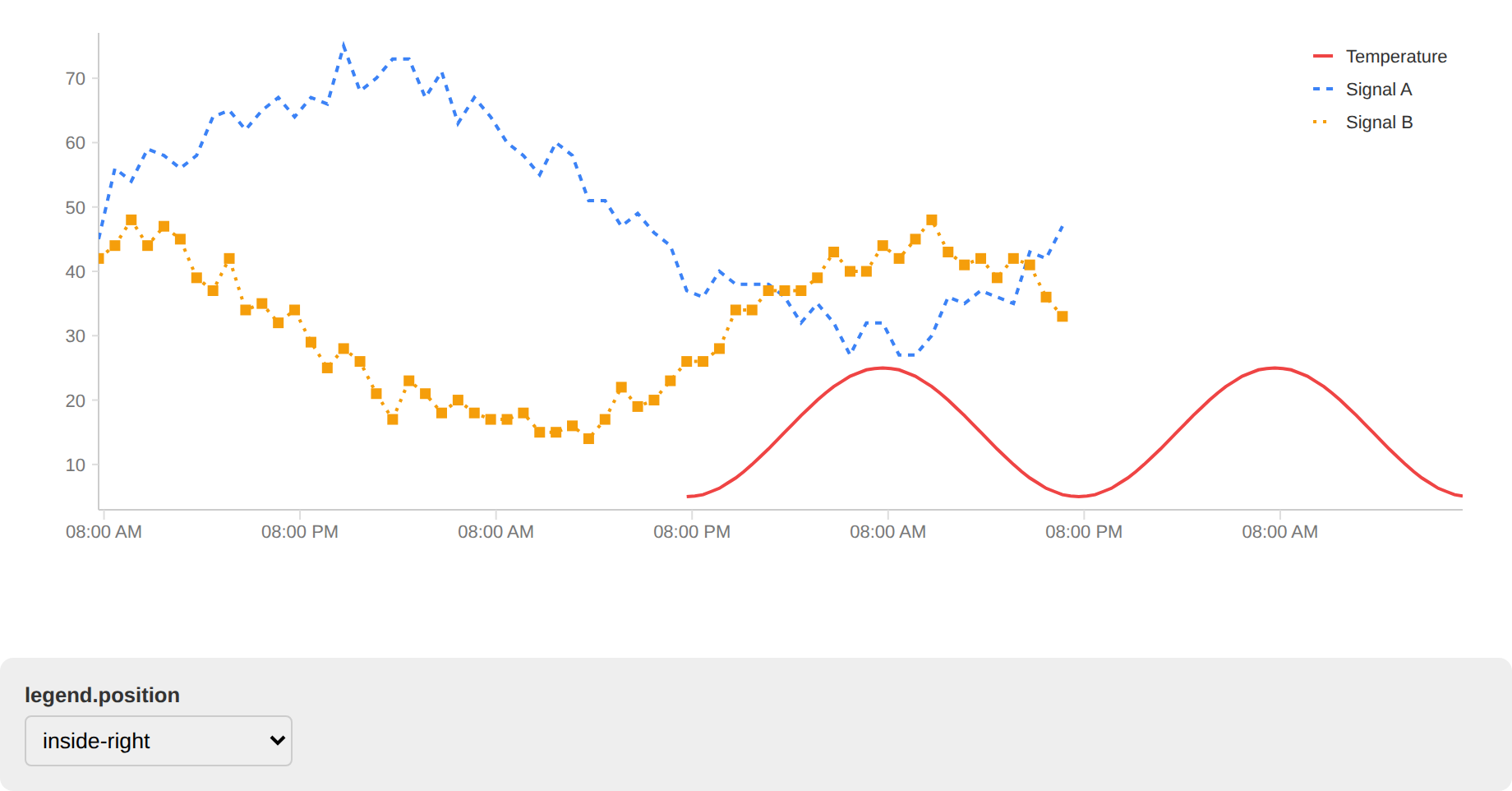
Set position: 'separate' and the library draws none —
chart.legendItems() hands you what it would have drawn, and you decide where it
goes and what it does. That is still the way when the legend belongs in HTML
below the chart, or into a sidebar, or when it needs more than a click.
Each item carries more than a name and a colour — the line variant of its series
and, if the chart draws one, its marker. That matters as soon as the picture
leaves the screen. On a printed page every coloured square is the same grey, and
a reader who cannot separate red from green was never helped by the colour in the
first place; the dashes and the symbol survive both. Build the swatch with
drawMarker and the renderer, and it cannot drift from the curve it names.
A marker is reported only when it is actually drawn: a series that hides its markers above a few hundred samples gets no symbol in the legend either. A symbol that is missing from the chart states something untrue, and on paper nobody can check.
Your own tooltip
The built-in tooltip is HTML the library writes. Once it has to look like the rest of your application, you want the data instead and write the HTML yourself. Three pieces do that:
import { MLTimeGraph, autoMargin, zeigerImSvg } from 'ml-time-graph';

const chart = new MLTimeGraph({ ...options, margin: autoMargin(options) });

svg.addEventListener('pointermove', (e) => {
  const { x, y } = zeigerImSvg(svg, e.clientX, e.clientY);  // any scaling, any viewBox
  const p = chart.plotRect;                                  // the drawing area
  if (x < p.x || x > p.x + p.width) return hide();
  show(chart.pointsAt(x, y, { overlays: true }));            // one row per series
});
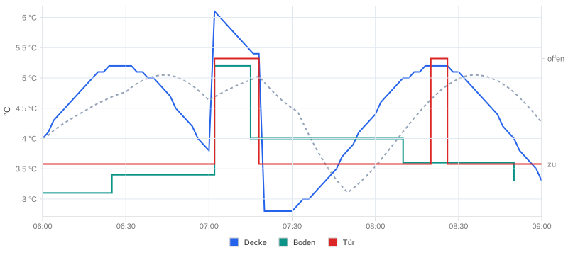
pointsAt gives the value the drawn line shows at the pointer — in fixed order,
not sorted by distance. A step line holds its last value; a sensor that only
reports on change gets its last reading, marked held with its own time; an
enum series brings its label ("open") as well as the number. plotRect is
the area inside the margins, so a crosshair needs no margin arithmetic, and
autoMargin computes margins from what is actually drawn — axis labels, titles,
threshold labels outside the plot.
A whole dashboard
Several charts, one shared time range, synchronised zooming.