Chapter 3: Thresholds, zones and markers
A series on its own says what happened. Only a threshold says whether it was acceptable. That is the difference between a chart you look at and one you act on.
The line
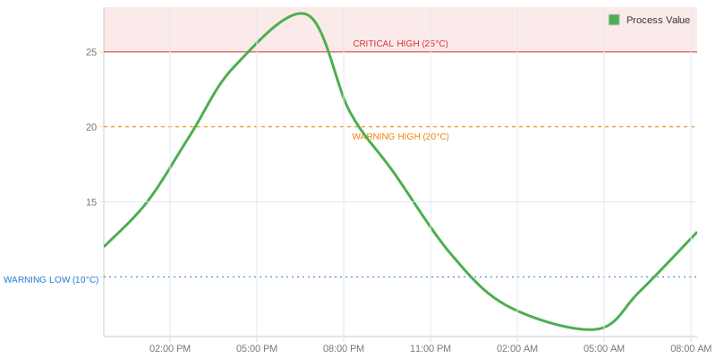
The simplest case: a named limit as a dashed line.
thresholds: [{ name: 'crit', value: 22, color: '#e11d48' }]

// where the label goes: above, below, outside-left, outside-right
thresholds: [{ name: 'crit', value: 22, label: { text: 'CRITICAL', position: 'above' } }]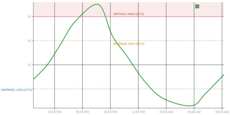
Limits in view
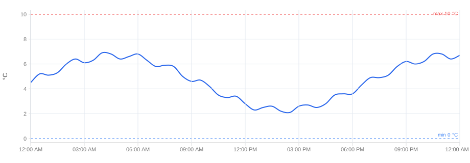
The automatic value range follows the readings. With readings of 2–7 °C and limits at 0 and 10 °C, both limit lines fall outside the chart — exactly the lines it was meant to show. One switch on the axis widens the range to the thresholds drawn on it:
axes: { left: { includeThresholds: true } }A threshold with line: 'none' is only a reference and does not count; an
explicit domain wins.
The area
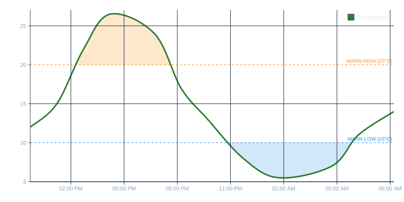
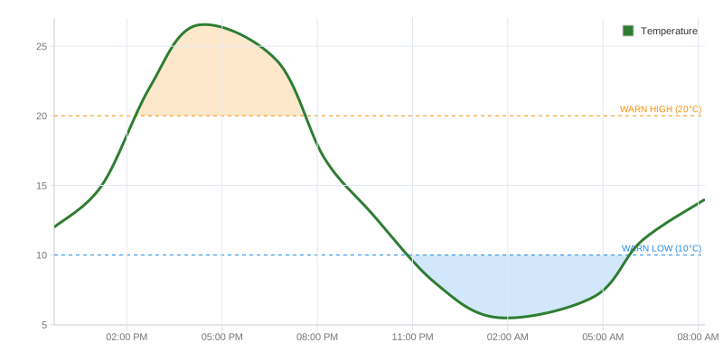
A line says where the limit is. An area says how long it was exceeded — and that is usually the real question.
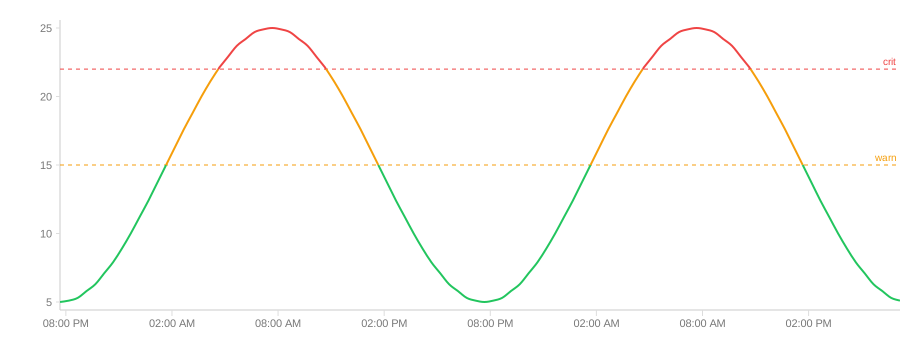
Colour by value
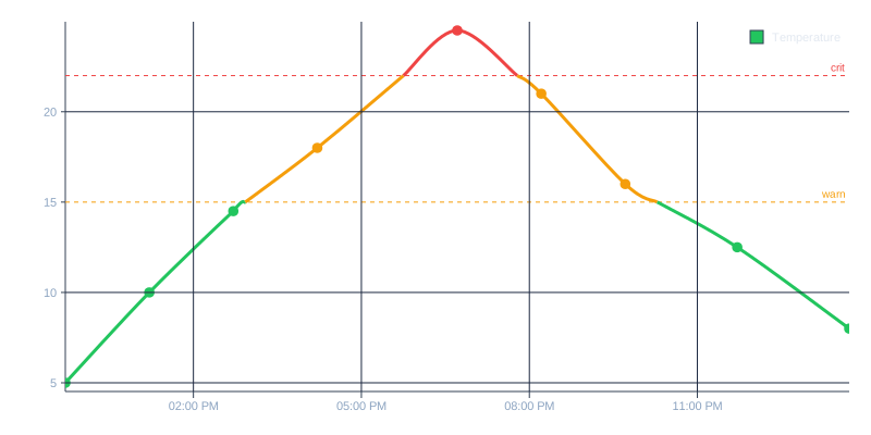
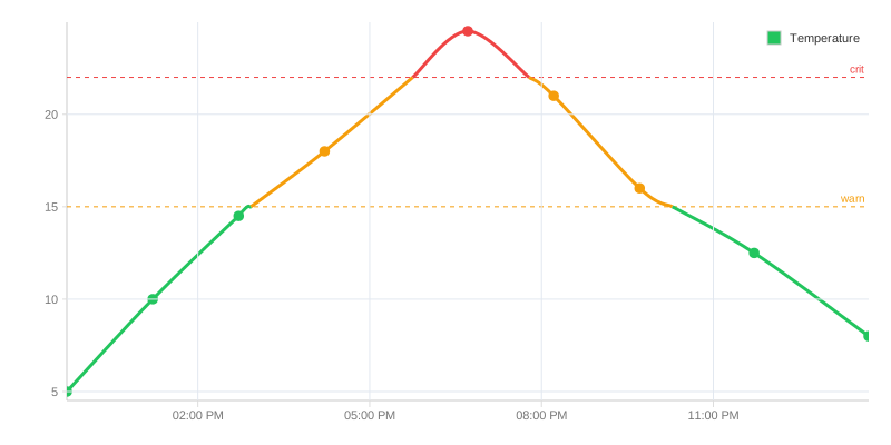
Instead of one limit, several: the curve takes the colour of the zone it is currently in. Useful for graded assessments — green, amber, red — and dangerous when the grades are arbitrary, because the colour then implies a certainty the data does not carry.
Marking periods
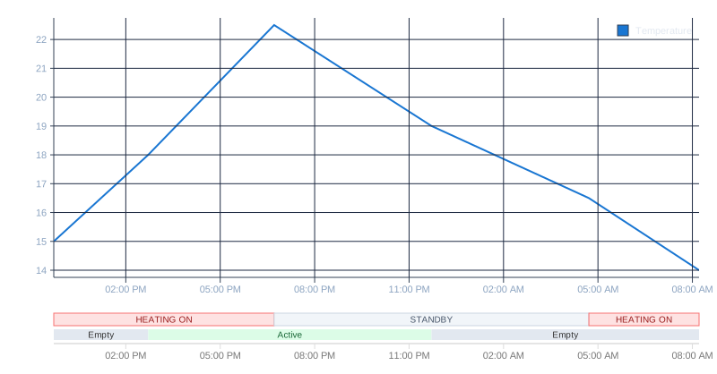
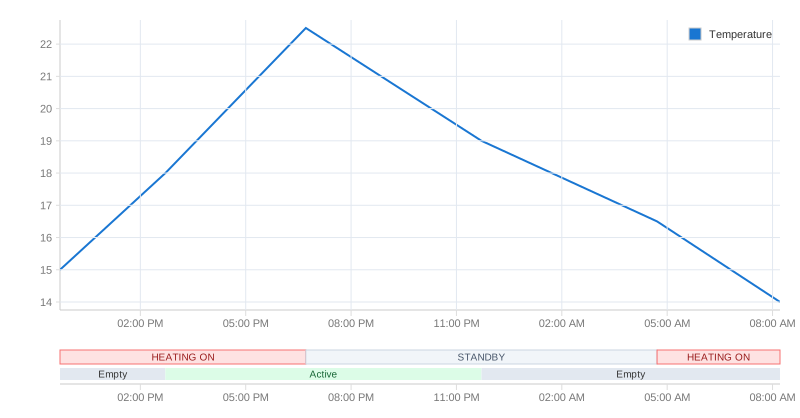
Sometimes the statement is not in the value but in the period: a maintenance window, an outage, a shift. Annotation bands sit behind the curve.
Two sensors that should agree
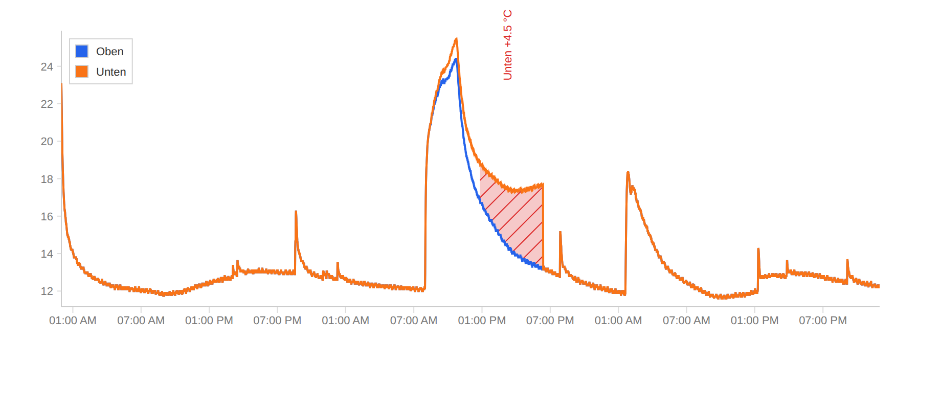
Two probes in one fridge are fine while they see the same thing. More than 2 °C apart, and something is wrong: one is icing up, one sits in the draught, one has drifted. A fill region between the two lines, with a condition, marks exactly that stretch:
series: [
  { ...top, style: { fill: { regions: [{
      from: 'series', to: { series: 'Bottom' },
      where: { exceeds: 2 },            // only where |Bottom − Top| > 2 °C
      fill: { color: '#dc262640' },
  }] } } },
  bottom,
]
The decision is made on the readings — linear between them, held on a step
line — not on the drawn curve, whose smoothing may overshoot. That is the right
basis for evidence. side: 'above' or 'below' asks for one direction only;
maxAgeMs draws nothing where one probe's last reading is too old to say
anything. divergenceExcursions() from ml-time-graph/analyze adds which
probe ran away, the half you can act on.
How long outside
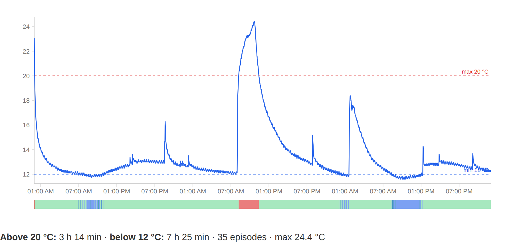
The question a GxP report asks is not whether the limit was exceeded, but
for how long in total. computeLimitExcursions answers it:
import { computeLimitExcursions } from 'ml-time-graph/analyze';

const { msAboveHigh, msBelowLow, excursions } =
  computeLimitExcursions(data, { low: 2, high: 8 });
// excursions: [{ startTime, endTime, side, extremum, durationMs }]
Strictly outside — exactly 8 °C is inside. A gap ends an episode, and the time
between two readings counts to the side where the second one lies. The Go port
(analyze.ComputeLimitExcursions) computes the same, so the screen and the PDF
report the same duration.
And interactively
The demo shows the same building blocks in the browser: six cards, each extending the previous one by exactly one idea. Code and values sit next to every step, on their own tabs.