Chapter 7: Svelte
Everything so far was the library: options in, SVG out, the same in the browser, on the
server and in the Go port. A page needs a little more — a container that changes width, a
pointer, a keyboard, a dark mode, a print dialog. ml-time-graph-svelte is that little
more, as two Svelte 5 components. The library still computes; the component wires it up.
npm install ml-time-graph ml-time-graph-svelteOne chart
<script lang="ts">
  import { TimeGraph } from "ml-time-graph-svelte";
  const options = { series: [{ name: "Fridge", data: readings }], axes: { left: { label: "°C" } } };
</script>

<TimeGraph {options} height={260} />
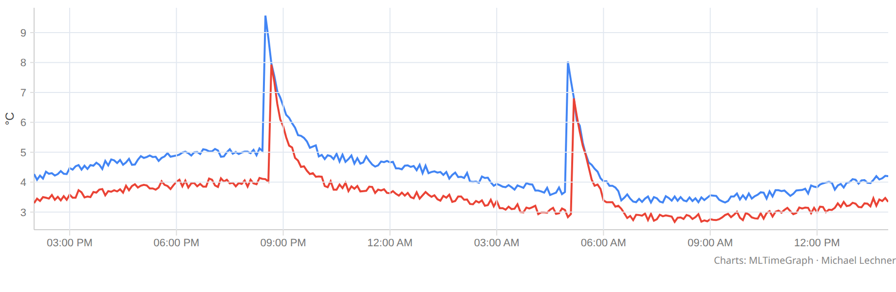
The options are the ones from the previous chapters, unchanged. The component draws at the
width of its container and again when it changes, takes the margins from autoMargin,
leaves a little room above and below the curve, and shows a tooltip — on hover, and on the
arrow keys once the chart has focus.
A legend you can operate
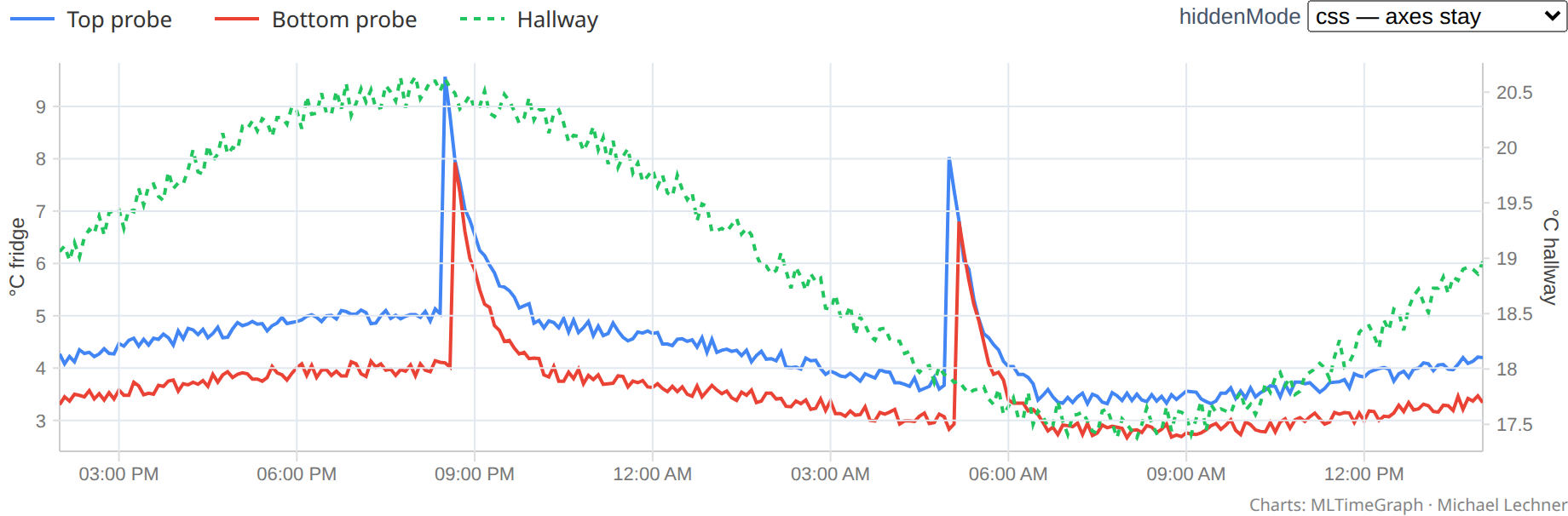
The SVG legend from chapter 4 is part of the picture — right for print, but not operable by
keyboard and it takes room inside the chart. <Legend> is a row of buttons beside it. Its
swatches come from the same functions that draw the lines, so a dashed series has a dashed
swatch at the same width.
<Legend items={legend} bind:hidden />
<TimeGraph {options} bind:hidden bind:legend />
Hiding keeps the axes by default: the scale is part of the comparison, and axes that jump
when you toggle a line are hard to read. hiddenMode="remove" lets them adapt.
Data in the tooltip, not HTML
The tooltip asks the library what each line shows under the pointer (pointsAt): a step line
holds its state, a sensor that reports on change gets its last reading, an enum series gives
its state name. A snippet receives exactly that and writes the markup; placement and
crosshair stay with the component.
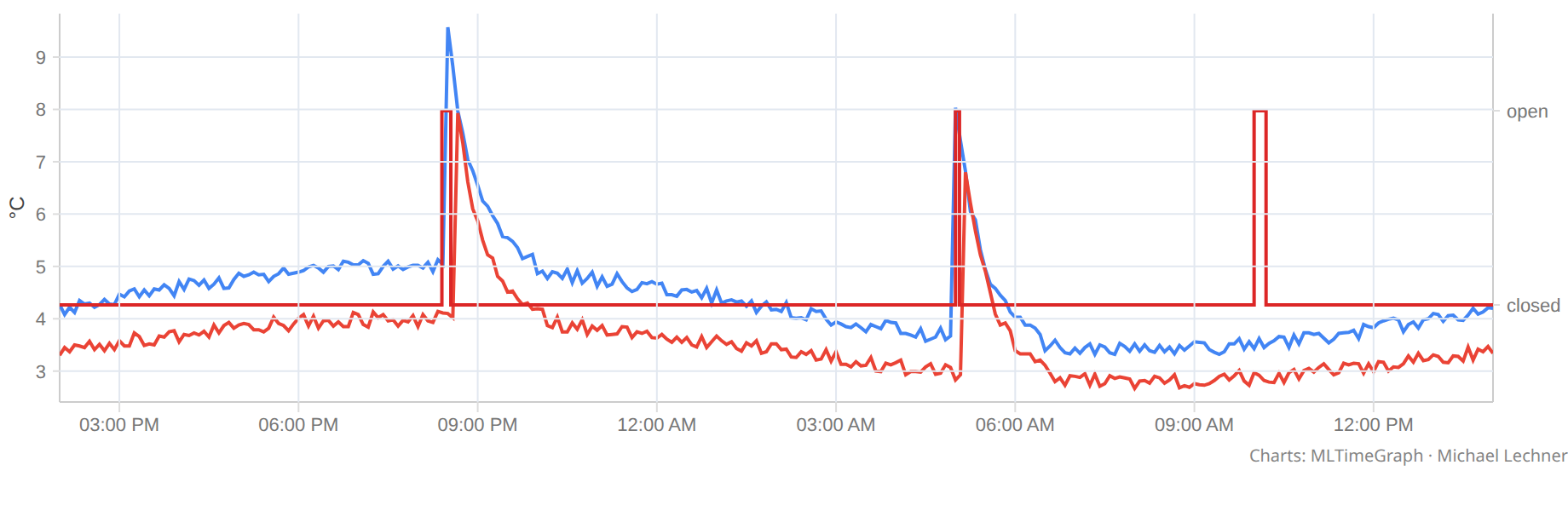
If you want no tooltip box at all, tooltip={false} turns off just the box. Crosshair, highlighted
points, onhover, the screen-reader announcement, zoom and keyboard all stay. That is the
"tooltip off, zoom on" switch of a chart toolbar; interactive={false} would take zoom and
keyboard as well.
Zoom
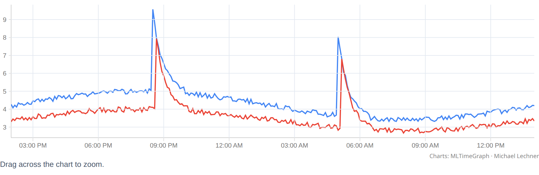
zoomable lets you drag a window across the time axis; the value axis follows what is
visible. Double-click or Esc goes back. With applyZoom={false} the component only reports
the window, and your app loads finer data for it.
Light, dark, print
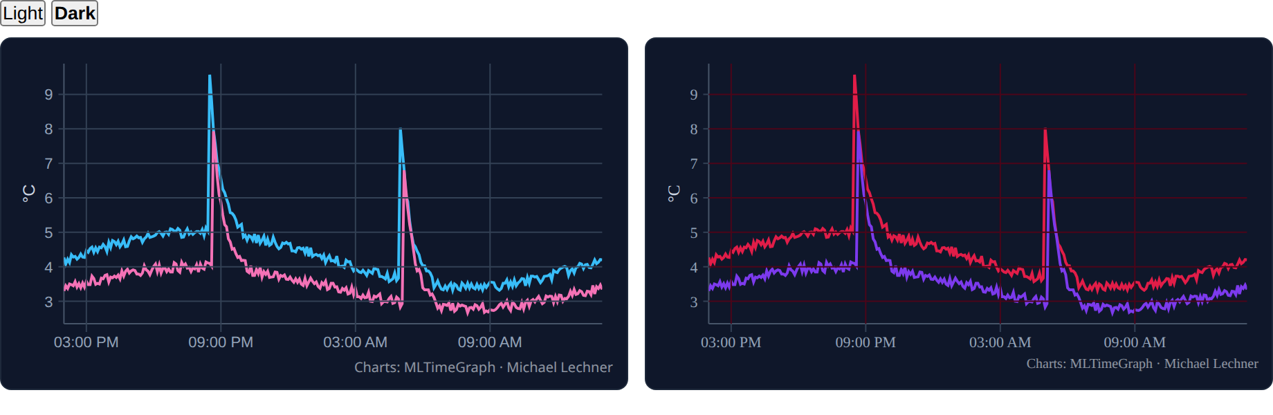
Dark mode follows a class on <html> by default; each chart gets its own theme, so two
charts never recolour each other. CSS variables (--mtg-grid, --mtg-palette, …) on any
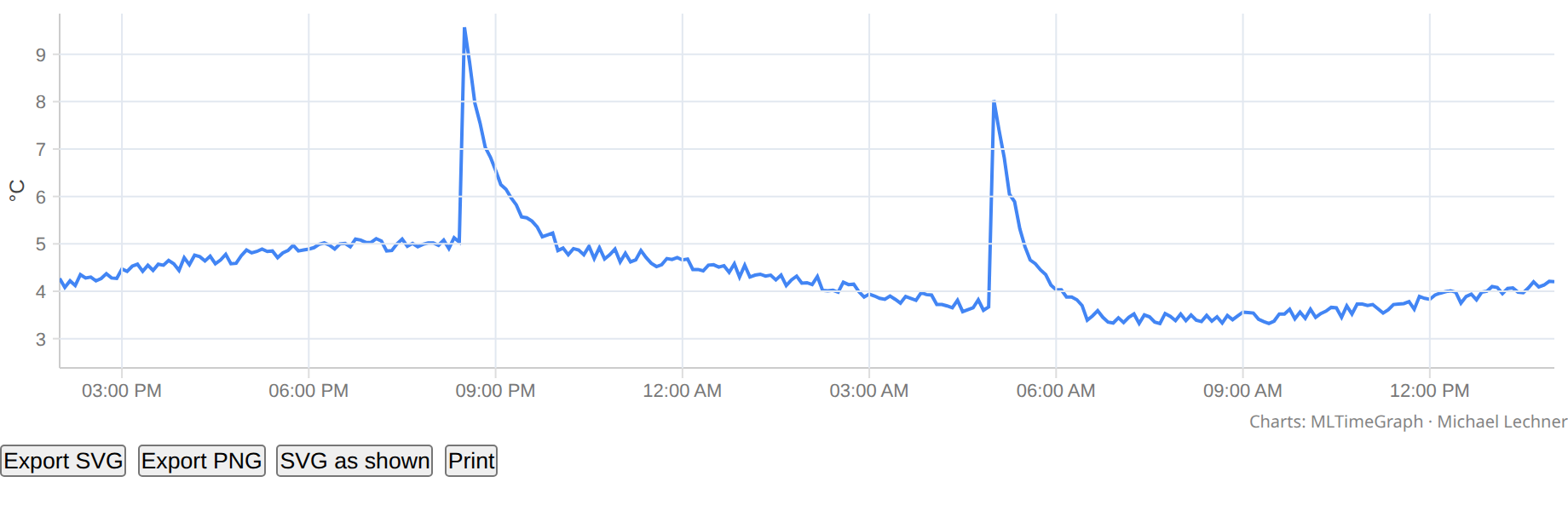
ancestor bring in your design tokens. Printing redraws in the light scheme with all series —
hidden is a view setting, not a deletion — and the exports do the same.
A board
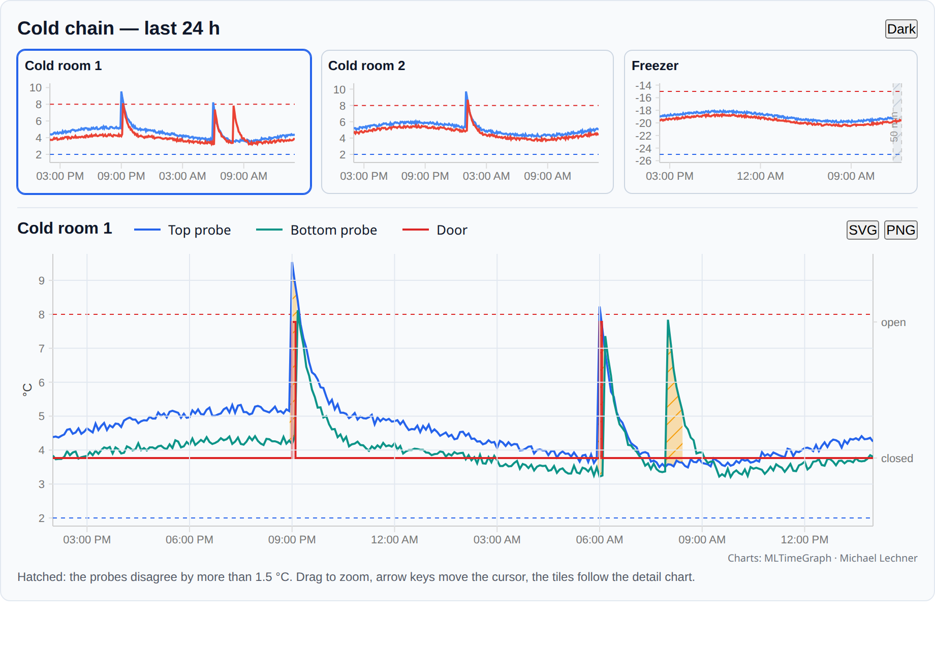
The pieces together, the way a monitoring application uses them: tiles that follow the
cursor of the detail chart (syncTime), a probe that went quiet (gaps.atEnd), two probes
that disagree (where), limits that stay in view (includeThresholds), zoom and export.
It is one Svelte file; the Code tab shows it.
If the synced time lies outside a tile's window, the tile shows a small arrow at the edge of its
plot, pointing to where the moment lies, instead of showing nothing.
The full reference — every prop, the snippets, the CSS variables, server-side rendering and the traps — is the package README: ml-time-graph-svelte on npm.